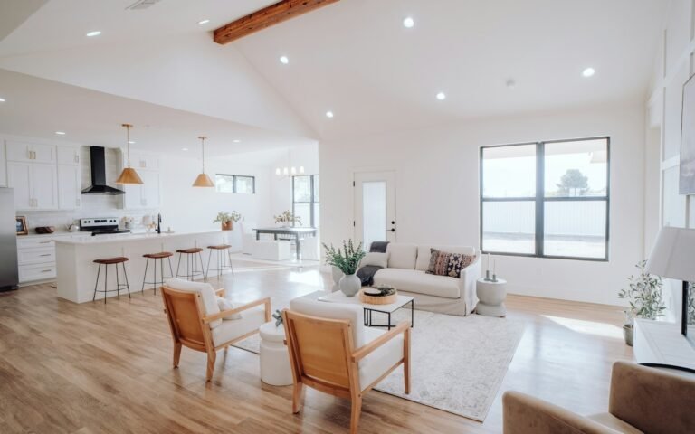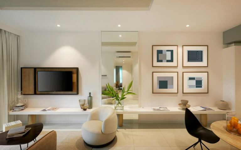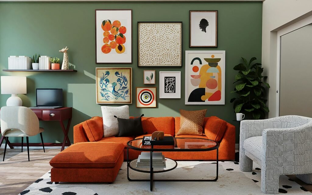
Choosing paint looks easy until you stand in front of a shade card with a thousand options. I have watched many homeowners in Bangalore pick a colour they loved on a small chip, only to find it looked completely different on a full wall. In this guide I share the room wall paint colour combination ideas my team actually uses in apartments, room by room, from the living room and bedroom to the kitchen, foyer and kids room.
Every combination here is written for real Bangalore homes: compact rooms, mixed natural light, and a climate that moves between warm afternoons and cool, damp monsoon evenings. I will also explain the simple rules we follow so you can build your own combinations with confidence.
How to choose a room wall paint colour combination
Before we go room by room, here are the four rules I use on every project. If you follow them, almost any combination will work.
- Use the 60-30-10 rule. Let one colour cover about 60% of the room (usually the walls), a second colour take 30% (an accent wall, curtains or furniture), and a third colour fill the last 10% (cushions, art, small decor).
- Check the light direction. North-facing rooms get cooler, softer light, so warm whites and beiges work better. South and west-facing rooms get strong afternoon sun, so cooler greens, greys and blues keep them comfortable.
- Pair a light base with one deeper accent. Light walls make compact Bangalore apartments feel larger. One deeper wall adds character without closing the room in.
- Test on the wall, not the card. Paint a 2 ft by 2 ft patch on two different walls and look at it in the morning, afternoon and under your evening lights before deciding.
Colour combinations at a glance
If you just want a quick starting point for every room in your apartment, use this table. I explain each room in detail further down.
| Room | Main wall colour | Accent or pairing colour | Mood | Finish I recommend |
|---|---|---|---|---|
| Living room | Warm white or greige | Sage green or terracotta | Welcoming, social | Washable matt or soft sheen |
| Master bedroom | Soft beige or pale grey | Deep green or dusty blue | Calm, restful | Matt |
| Kids room | Off-white | Powder blue with blush pink, or mint with yellow | Playful, bright | Washable, stain-resistant |
| Kitchen | White or cream | Mint, olive or navy cabinets | Fresh, clean | Washable semi-gloss |
| Foyer and entrance | Light grey or ivory | Charcoal, teal or wallpaper panel | First impression | Washable matt |
| Dining area | Cream | Mustard or warm wood tones | Cosy, appetising | Soft sheen |
| Study or work corner | Light grey | Muted blue or olive | Focused | Matt |
| Balcony | White | Sage, terracotta pots | Relaxed | Exterior-grade emulsion |
Living room wall paint colour combinations
The living room is where guests form their first real impression, and it is also where your family spends the most time together. I usually keep three walls light and use the TV wall or the sofa wall as the accent.
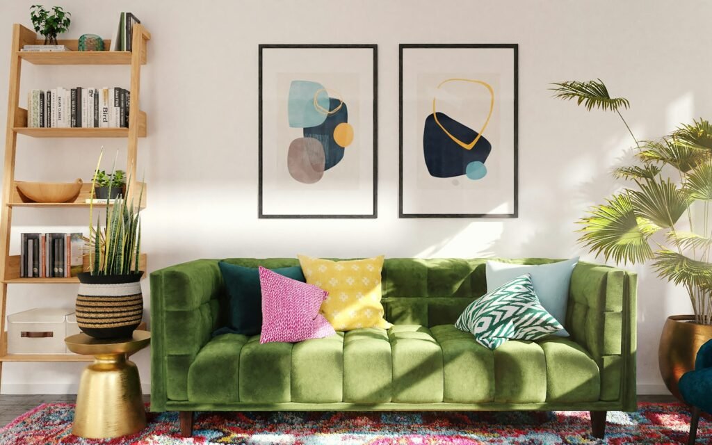
Combinations that work well in Bangalore living rooms:
- Warm white with sage green. Sage is calming and pairs beautifully with wooden furniture and indoor plants. This is one of my most requested combinations.
- Greige with terracotta. Greige (a mix of grey and beige) is a forgiving base. A terracotta accent wall adds warmth that feels very at home in South Indian interiors.
- Ivory with navy blue. Navy behind a TV unit hides screen glare and gives the room a polished, hotel-like finish.
- Soft beige with mustard. Good for west-facing rooms where you want energy without harsh brightness.
- Light grey with blush pink. A modern combination for homes with white or light oak furniture.
If you like following trends, Asian Paints named Moonlit Silk, a warm luminous neutral, as its Colour of the Year for 2026. Neutrals like this make an excellent 60% base for any of the accents above.
Bedroom wall paint colour combinations
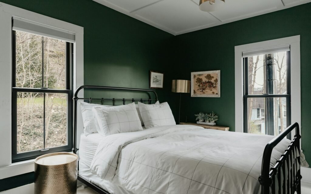
Bedrooms should help you slow down, so I avoid very bright or saturated colours on large surfaces. The wall behind the bed is the natural place for a deeper shade, because you do not face it while lying down.
| Bedroom type | Combination | Why it works |
|---|---|---|
| Master bedroom | Pale beige walls with a deep forest green headboard wall | Rich but restful, and it pairs well with wood and brass |
| Master bedroom | Soft grey with dusty blue | Cool and calm, ideal for west-facing rooms that heat up in the afternoon |
| Guest bedroom | Warm white with light taupe | Neutral and welcoming for any guest |
| Parents room | Cream with soft peach | Warm, cheerful and easy on the eyes |
| Compact bedroom | All walls in one light shade with a darker ceiling border | Keeps a small room feeling open |
One tip I always give: match your bedroom accent colour to the wardrobe laminate or headboard fabric. When the carpentry and the paint talk to each other, the room looks designed rather than decorated.
Kids room colour combinations
Children love colour, but they also grow fast. I suggest keeping the base walls neutral and adding colour through one feature wall, stripes or stencils that can be repainted easily in a few years.
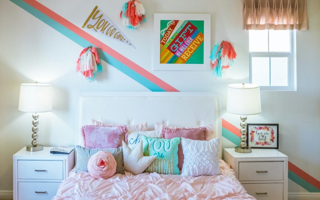
- Off-white with powder blue and blush pink stripes. Playful, gender-neutral and easy to update.
- Mint green with sunny yellow. Bright and cheerful, good for play areas and study corners.
- Light grey with coral. A more grown-up option that works well for older kids and teens.
- White with a chalkboard wall. Practical and fun, and it doubles as a study board.
Always choose a washable, low-VOC paint in kids rooms. It makes cleaning crayon marks much easier and keeps the air healthier.
Kitchen colour combinations
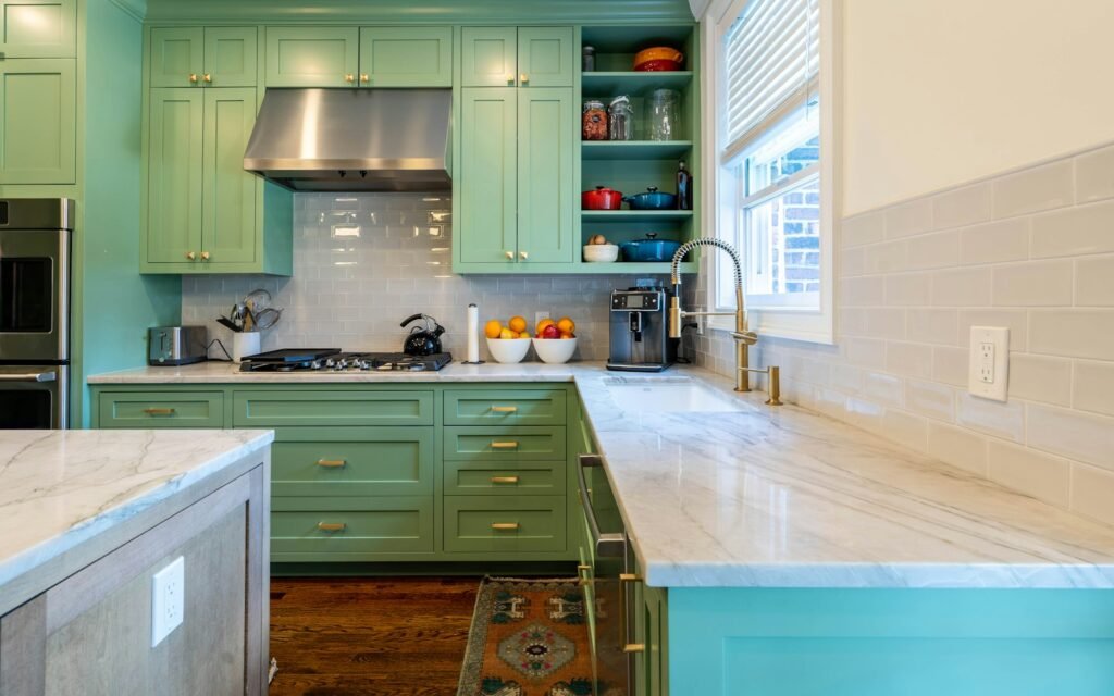
In the kitchen, the cabinets usually carry more colour than the walls, so I plan the wall paint and the modular kitchen shutters together. Walls above the counter should be washable, because cooking splashes and steam are part of daily life.
| Cabinet colour | Wall colour | Countertop that suits it |
|---|---|---|
| Mint or sage green | White or cream | White quartz or light marble |
| Navy blue | Off-white | White quartz with brass handles |
| Olive green | Warm beige | Black granite or wood-look top |
| White | Soft grey or pale yellow | Grey quartz or black granite |
| Wood finish | Ivory | Beige or white quartz |
Foyer and entrance colour combinations
The foyer is small, but it sets the tone for the whole home. Because most Bangalore apartment entrances have little natural light, I keep the walls light and add personality through one feature.
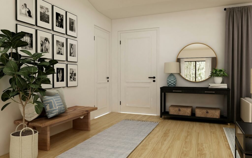
- Ivory with a charcoal panel behind the shoe cabinet or console.
- Light grey with teal for a bold, modern welcome.
- Warm white with a wallpaper panel or a textured finish for a premium look.
- Cream with wood cladding if your main door is a rich wood finish.
Add a mirror opposite or beside the door. It reflects light and makes a narrow entrance feel twice as wide.
Dining area and other spaces
Dining areas in Bangalore apartments often share a wall with the living room, so I treat them as one space with a slightly warmer accent. Cream with mustard or warm terracotta works well, because warm tones feel inviting around food. For a study corner, light grey with muted blue or olive helps concentration. For balconies, a white or sage exterior-grade emulsion keeps the space cool and lets your plants become the colour.
Paint finish and cost guide for Bangalore
The right finish matters as much as the colour. Here is what I recommend and what you can expect to pay for labour and material in Bangalore in 2026.
| Paint type | Where to use it | Approximate cost per sq ft |
|---|---|---|
| Economy emulsion | Ceilings, low-use rooms | ₹12 to ₹18 |
| Standard washable emulsion | Living room, bedrooms | ₹18 to ₹28 |
| Premium emulsion | Kids room, kitchen, foyer | ₹28 to ₹45 |
| Texture or designer finish | Single feature wall | ₹45 to ₹80 and above |
Rates include standard surface preparation. Wall putty, primer, GST and the condition of your walls can change the final figure.
Common mistakes to avoid
- Choosing from a tiny shade card. Colours look darker and more saturated on a full wall.
- Painting a small room in a dark colour on every wall. Keep deep shades to one wall in compact rooms.
- Ignoring the floor and furniture. Your vitrified tiles, laminates and sofa fabric are part of the colour scheme.
- Skipping putty and primer. Most paint problems in Bangalore homes come from poor preparation and damp walls, not from the paint itself.
- Using too many accent colours. One strong accent per room is usually enough.
If you are planning complete interiors and not just paint, my interior design cost guide for Bangalore explains how painting fits into the full budget.
Frequently asked questions
What is the best room wall paint colour combination for a small apartment?
Use a light base like warm white, ivory or pale grey on most walls and add one deeper accent wall in sage, dusty blue or terracotta. Light bases reflect more light and make compact rooms feel larger.
Which colours are best for a bedroom according to interior designers?
Soft, muted colours such as beige, pale grey, dusty blue and sage green work best because they are calming. A deeper shade like forest green or navy looks great on the wall behind the bed.
What colour combination suits a living room with a TV wall?
Keep the side walls light and paint the TV wall in a deeper shade like navy, charcoal or sage. A darker background reduces glare and makes the TV unit stand out.
Which paint is best for kitchen walls in Bangalore?
Choose a washable or semi-gloss emulsion for kitchen walls, especially above the counter. It handles steam and splashes better and can be wiped clean without losing its finish.
How often should I repaint my apartment in Bangalore?
Interior walls usually need repainting every five to seven years with a good quality emulsion. Kids rooms and kitchens may need it sooner, especially if they were painted with non-washable paint.
Can I combine two bold colours in one room?
Yes, but balance them with plenty of neutral space. For example, a terracotta wall can sit beside a navy sofa if the other walls, ceiling and floor stay light.
Final thoughts
A good room wall paint colour combination is not about following a trend. It is about light, proportion and how you want each room to feel. Start with a light base, choose one accent per room, test on the actual wall, and plan your paint together with your kitchen, wardrobes and furniture.
If you would like help choosing colours as part of your home interiors, my team can visit your home for a free site visit and estimation, and we can show you each combination in 3D designs before a single wall is painted. You can also message us on WhatsApp at 82176 94115.